
Many people believe that to run effective ads, the visuals must be extremely flashy, filled with special effects, and highly elaborate designs.
But the truth is quite the opposite.
Overcomplicated visuals, packed with too many details or fancy effects, often make it hard for viewers to focus on the main product.
You don’t need a piece of art — you need an image that makes people want to click, as quickly as possible.
What’s the real goal when you’re running affiliate campaigns?
It’s not just to impress — it’s to drive direct response.
We want customers to click on the ad, and more importantly, we want them to convert. That’s the true purpose of advertising.
In this article, I’ll share a few simple design tricks to help your ad creatives capture attention faster and more effectively.
Because the higher your CTR, the more profitable your campaigns will be.
Why Is CTR Important in Affiliate Marketing?
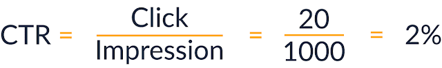
CTR = Clicks / Impressions
Let’s say your ad gets 1,000 impressions and 20 clicks:
If you’ve read my articles carefully, you’ll know that I don’t overly emphasize CTR.
Here’s why:
1. CTR only tells you that people clicked on the ad — for some reason. It doesn’t guarantee they are the right audience, or that conversions will happen.
2. CTR is often overhyped. Many affiliates love to throw around the term “CTR” because it sounds professional. And honestly, boosting CTR isn’t that hard — just split test different variations and you’ll likely find something that gets more clicks.
In the world of affiliate marketing, people talk about CTR all the time, praising it like it’s some kind of magical metric.
3. CTR can mean different things at different stages.

Years ago, when people were making money with AdSense, CTR was everything — because the higher the CTR, the more money they made.
Every time someone clicked on an AdSense ad on their website, they earned a few cents.
But if you’re an affiliate marketer — or someone running paid ads — you need to look beyond CTR and see the bigger picture.
For example:
Let’s say you’re promoting a mobile game on Facebook.
If you use an ad image featuring attractive models, your CTR will skyrocket — because guys will click instinctively when they see pretty faces, without even reading the ad.
But what happens next?
You get a flood of low-quality clicks.
People install the game, realize there are no “pretty girls” inside, and quickly uninstall it because it wasn’t what they expected.
In this case, a higher CTR actually loses you money, because you’re attracting the wrong audience — people who have no real interest in the product.
This is critical:
You’re paying for clicks, not impressions.
The real goal is to attract the right people for the right offer.
So how do you achieve that?
I’ve written other guides on crafting headlines, ad copy, and targeting — but in my experience, a strong, well-designed image often boosts CTR more effectively than anything else.
And there are a few simple tricks you can use to make your visuals more appealing, attention-grabbing, and curiosity-driven — without misleading your audience.

How a High CTR Benefits Affiliate Marketers
The higher your CTR, the lower your CPC.
On platforms like Facebook Ads, there’s also a key metric called Relevancy Score — which measures how well your ad matches your audience’s interests.
For example:
Suppose you’re promoting a game on Facebook with the headline:
“Play For Free Now – The Best FPS of 2025.”
People see “free” and eagerly click the ad, only to find out that they actually have to pay to play the game.
What happens next?
They bounce off the offer page, leave angry comments, or worse, report your ad.
This might sound extreme, but if you pull tactics like this repeatedly, Facebook will eventually shut down your ad account.
Here’s why:
Facebook tracks not only how many people click your ad, but also how they react after clicking.
If Facebook sees that users enjoy the experience — meaning they stay, engage, or convert — your ad’s Relevancy Score goes up.
A higher Relevancy Score means cheaper clicks.
It also means you’re reaching the right audience and providing them real value when they interact with your ad.
The same principle applies to Google Ads:
The more relevant your landing page is to the search keywords, the lower your cost-per-click (CPC) will be.
Ultimately, companies like Facebook and Google want users to have the best experience possible — and they want you, the advertiser, to succeed.
Because when you make money, they make money too.

Think about it this way:
If you upload 15 different ad images and no one clicks, you earn nothing.
At that point, other factors like conversion rate or funnel optimization become irrelevant — because without clicks, there’s no traffic to convert.
A High CTR Helps You Test Faster
If your CTR is low, testing ads becomes expensive and time-consuming.
When you’re testing landing pages, ads, verticals, or offers, you need to test as quickly and efficiently as possible.
With a high-CTR ad, you can immediately move on to testing other elements — like the landing page — without wasting time or budget.
But if you try to split test landing pages while running low-CTR ads, you’re essentially throwing money and time away.
You need to focus on the entire funnel and think strategically.
How to Find Unique Visuals for Your Affiliate Campaigns
Back in 2014, statistics showed that the average person saw around 362 images per day.
With the explosion of social media since then, that number has surely skyrocketed.
Because people are bombarded with so many images daily, their brains have developed a natural filter — ignoring irrelevant visuals and focusing only on what seems important.
That’s why the very first goal of your ad image is to STAND OUT.
You need to make them stop whatever they’re doing and think:
“Whoa, what is that?”

First, your images must be relevant to the offer.
Common affiliate offers usually fall into niches like dating, weight loss, fitness, beauty, app installs, travel, insurance, and so on.
Think of related keywords to start your search.
For example, if you’re promoting a weight loss product, you could search using keywords like:
- Before / after
- Fat to skinny
- Crazy weight loss
- Biggest weight loss ever
- Skinny to ripped
- Most ripped guy ever
- Fattest person ever
- Person eating junk food
In just five minutes, you’ll easily find plenty of images based on a few keyword ideas.

Next, upload the images you like to Google and use the “Search by Image” feature to find similar visuals.
Pay close attention to which images grab your attention — and more importantly, what emotions they trigger.
A powerful image might make you feel shocked, weirded out, demotivated, offended, attracted, happy, or motivated.
Choose the images that evoke the emotion you want your audience to feel.
Important Note:
If you don’t want legal troubles, don’t use copyrighted images without permission.
If you find an image you really love but can’t legally use, you can recreate a similar version using AI tools.
As of 2025, one of the most powerful AI image generators I know is Sora AI.
In the past, when I needed images for ads or websites, I had to buy them from stock platforms like Shutterstock — simply because licensing was mandatory.
While Facebook and Google now offer built-in libraries of free-to-use images, in my experience, they’re still not enough for high-impact campaigns.
Today, with AI evolving rapidly, traditional stock photo companies are facing a serious crisis.
When you can create stunning images with AI, why would you keep paying high fees for stock photos?
Using AI-generated images can save you a lot of money.
Some people are happy about it.
Others are not.
Well… that’s just how the world works.
One more caution:
Be very careful when using “before and after” images — they can get you into legal trouble if not handled properly.
You can also find free images legally through platforms like Flickr or other sites offering CC0-licensed images.
And interestingly, sometimes uglier images convert better than polished, perfect ones.

14 Proven affiliate ad design tricks to boost CTR in affiliate marketing
Here are some of my best design tricks (so far) — techniques that can dramatically boost your CTR.
Note: Some of these tricks are a bit “gray hat,” while others are commonly used by Fortune 500 companies.
I won’t tell you exactly where or when to apply them.
Partly because advertising rules and platform policies can change at any moment — meaning this blog post could become outdated — and partly because there are just too many different niches for me to cover them all.
If you’re running Facebook Ads, your focus should be grabbing attention to get clicks — without misleading users, causing confusion, or tricking Facebook’s review system.
Trick #1: Highlight with Crazy Borders
This technique is surprisingly effective.
First, it immediately grabs attention.
Second, once people notice a crazy, standout border, they’re almost forced to look at the image itself.

And if your image isn’t bad, that extra attention can make a big difference in clicks.
If you can compress the Crazy Border layer small enough not to impact your ad’s loading speed, it will definitely help your ad stand out.
Quick update: Nowadays, you can easily create Crazy Borders using Canva — much simpler than working with Photoshop.
Alternatively, you can upload your image to an AI image editor and instruct it to add a border (without altering the original picture).
Trick #2: Blend Colors to Match (or Contrast) the Traffic Source
If you know the dominant colors of your traffic source, try blending your ad colors to match — or deliberately contrast — with it.
On Facebook, things are a bit stricter, so going for contrast usually works better.
Since Facebook’s primary color is blue, using a contrasting color like orange can help you grab attention. (The image below uses a combination of orange, white, and blue.)

If you want to play it safe, you can stick with gray, white, and blue tones on Facebook — they tend to blend naturally and work well.
However, be careful:
Facebook doesn’t like it when advertisers try to mimic their branding too closely.
Think carefully: is there anything you can add to your creative that subtly matches the look and feel of the Offer Owner’s site — without crossing the line?
Old tricks like fake scroll bars are outdated now, but there’s always room for innovation.
Smart, subtle mimicry of an advertiser’s environment can still boost conversions when done right.
Trick #3: Add a Call-to-Action (CTA) Button
The car ad image you see above was generated with AI.
Here’s how I did it:
I simply told AI (via ChatGPT) that I needed an ad image featuring a car and a CTA button, with specific text. Then I asked AI to generate a prompt for me.
I copied that prompt into an image generation tool like Sora, and just waited for the result.
It’s that simple.
And just like that, I had a solid ad creative ready to go — complete with a CTA button.
You can also experiment with different CTA styles.
Just search online for terms like “CTA button examples“ to find inspiration and see what might fit your campaign best.
Trick #4: Big, Bold Text
There’s a reason Facebook limits the amount of text allowed in ad images — because it works.
In fact, it works so well that they had to regulate it.
Adding huge, bold headlines and packing more text into your images can significantly boost your CTR.
Need inspiration?
Just take a look at magazine covers — most are crammed with bold titles, descriptions, vibrant colors, and eye-catching images.

Trick #5: Point at Something
ViralNova used this trick all the time — and it’s been widely used across many platforms because it grabs attention.
The basic idea is this:
The image tells the viewer, “there’s something important here — look at it!”
You can use arrows, underlines, or circles to highlight a specific part of your image.

But be careful: Don’t overdo it.
Some YouTubers abuse this method — they add arrows and circles to thumbnails just to bait clicks, but when viewers watch the content, it has nothing to do with what was highlighted.
This leaves people feeling annoyed and disappointed.
Always make sure what you highlight is genuinely relevant — otherwise, you’ll damage trust, not build it.
Trick #6: Place the Image Above the Headline or Text
This isn’t exactly a Photoshop trick, but it’s something you should definitely know.
David Ogilvy, one of the legends of the advertising world, emphasized this strategy in his book.
Here’s why:
People love looking at images, and they often skip over headlines just to focus on the visuals.
By placing an image above the headline, you give them what they want first — the picture — and only then guide them to read the headline without distraction.
Moz successfully uses this layout style: first an image, then a headline underneath.

Think about it:
When people skim content, they naturally focus on visuals, numbers, and bold elements.
So when you place the image at the top, they’re drawn to it first — then they seamlessly move on to the headline directly below.
Ogilvy also found through his research that descriptions are read four times more often than headlines — so make sure your description includes a strong, clear Call to Action (CTA).
Trick #7: Enhance the Visuals
If your ad features people, you must make them look good — no exceptions.

For images featuring women, you might:
- Remove freckles
- Adjust lip color to be slightly darker
- Brighten or enhance eye color
For images featuring men, you might:
- Sharpen hair color
- Define the jawline
- Enhance muscle tone
- Remove blemishes
Even simply enhancing the colors of their clothing — making reds deeper, blacks richer, and whites cleaner — can have a surprisingly big impact.
These are more advanced Photoshop techniques, but honestly, you shouldn’t spend too much time on them.
Focus your energy on mastering the basic principles first — those will make the biggest difference in your campaigns.
Trick #8: Blur the Background to Draw More Attention
Blurring the background can help pull attention to the main subject.
Most images you find online are sharp from edge to edge.
Because of that, the brain tends to quickly filter them out — they look just like every other image people see all day.
If you want viewers to stop and spend an extra moment looking, you need to create a focal point — and blurring the background is a simple yet highly effective way to do it.

Example:
No one knows what the iPhone 18 looks like yet.
A slightly blurred teaser image would instantly create a sense of mystery and spark curiosity.
How to blur the background using Photoshop:
- Unlock the background layer (double-click if needed).
- Use the Polygonal Lasso tool or Select Subject (faster) to select the main subject.
- Copy (Ctrl+C) and Paste (Ctrl+V) the selected area into a new layer.
- Select the background layer.
- Go to Filter > Blur and experiment with options like Gaussian Blur or Lens Blur.
- Fine-tune the blur amount so the subject stands out while keeping the image natural.
Quick Tip:
If you want a faster solution, you can use online tools like Fotor, Canva, or Pixlr to blur images in just a few minutes.
Trick #9: Add a Fake “Play” Button

Did you just click the Play button?
Sorry — it’s just an image, not a real video…
This trick can be very effective, but use it carefully.
Some traffic sources strictly forbid this technique, but on others, it’s allowed — and it works surprisingly well.
If you actually have a video on your landing page, adding a Play button overlay is perfectly fine.
But if you add a Play button just to boost CTR without linking to a real video, that’s definitely gray hat — and it can frustrate users.
And trust me, if you try this on Facebook Ads, you’ll get into trouble quickly.
However, on some other native ad networks or smaller traffic sources, it’s still an acceptable tactic.
How to add a Play button?
It’s easy — just find a “Play” icon (preferably in PNG format), and overlay it onto your image where it looks natural, as if the viewer is about to start a video.
Trick #10: Apply Creative Photo Editing Techniques
DesignCrowd is a pretty interesting blog.
They share tons of creative photo editing ideas — and if you spend a little time exploring, you can pick up some fun techniques to make your images stand out.
For example, they teach you how to edit a photo of a person and turn it into a tattoo design.
Imagine creating a tattoo of a baby, or a tattoo of a wild party scene — it can be pretty eye-catching.
Now, I’m not saying these effects will directly boost your CTR — I’m just suggesting a new creative style you can explore.
You can take these ideas, tweak them, and even use AI tools to design your own variations.
Another example: turning a person into a stone statue.
Just picture it — a giant stone statue of Donald Trump standing in front of the White House.
That would definitely grab attention.
Trick #11: Add Social Proof — Testimonials
Adding elements like likes, comments, and pins to your visuals can instantly boost trust — but of course, only if the numbers are real.

For example:
Suppose you’re running a campaign promoting an ebook about golf.
If your Facebook page already has a decent number of likes, you can create an ad image showcasing that number.
You see, social proof is a powerful psychological trigger.
It makes people feel more confident that they’re making the right choice when they see that others have already validated it.
Trick #12: Use Animated Images (GIFs)
Some high-quality traffic sources (like Facebook Ads and Google Ads) don’t allow GIFs in ads.
However, if the platform you’re using does allow them, animated images can be incredibly effective at grabbing attention.
GIFs can make viewers pause for a moment longer, because even slight movement within a static image triggers curiosity and visual focus.
How to create a simple GIF:
- Using Photoshop: Create multiple layers for each frame, then use the Timeline Animation feature to export a GIF file.
- Using online tools like Canva, Ezgif.com, or Crello: Simply upload your image, apply a basic motion effect (such as a slight blink, shimmer, or shake), and export your GIF in just a few minutes.
Pro Tips:
- You can animate the entire image, or just a small element (for example, a blinking light or a button that subtly shakes).
- Don’t overdo it — smooth, gentle movements work much better than aggressive, flashy animations.
- Get creative with GIFs — when used properly, they can significantly boost CTR and make your campaigns stand out.

Trick #13: Add or Remove Backgrounds
If your product focuses on a single object — like an iPhone, a car, or a watch — try changing the background to refresh the image and make it more eye-catching.
You don’t necessarily need Photoshop for this — today, there are plenty of free or free-trial tools that can remove backgrounds quickly and easily.
Recommended tools:
- Remove.bg: Instantly removes the background with just one upload, and works surprisingly well even with complex images.
- Canva: If you’re using the free plan, you can still access the “Background Remover” feature during the 30-day free trial of Canva Pro.
- PhotoRoom: A free app and website that’s great for removing backgrounds, especially if you want to do a little extra post-editing afterward.
These tools are extremely user-friendly — just a few clicks, and you’ll have a clean, transparent background ready to customize however you want.
Trick #14: Adjust HSB (Hue, Saturation, Brightness)

Sometimes when you look at an image, it just feels… incomplete.
Maybe it looks a bit flat, lacks depth, or doesn’t catch the viewer’s eye the way it should.
In these cases, adjusting the HSB settings — Hue, Saturation, and Brightness — can make a huge difference:
- Hue: Adjusts the overall color tone (e.g., making the image cooler or warmer).
- Saturation: Increases or decreases color intensity, making the image more vivid or more muted.
- Brightness: Controls how light or dark the image appears, helping it pop or creating a more dramatic mood.
Even small adjustments can dramatically improve an image — making it look more 3D, sharper, or warmer.
There’s no strict formula here — you’ll need to trust your eye and intuition to know when an image feels “just right,” and when it needs a little extra polish to truly stand out.
Finding Image Inspiration for Your Ads
If you’re looking for inspiration to design visuals for your affiliate campaigns, here are some great sources worth exploring:
- ViralNova: A massive collection of viral content and images — perfect for sparking creative ideas for your ads.
- DeviantArt: One of the largest art communities in the world, where designers and artists share their creative works. You can discover many unique and breakthrough visual styles here.
- WeirdWorm: Similar to ViralNova, WeirdWorm curates fascinating, quirky content that’s perfect for generating “out-of-the-box” advertising ideas.
- Spy Tools: Ad intelligence platforms like AdSpy, BigSpy, or Anstrex allow you to see successful ad creatives from competitors. A fast and effective way to find real-world inspiration.
- Bing Image Search: Personally, I find Bing provides clearer and more specific image search results than Google.
Plus, Bing’s Image Match feature lets you find similar images or see where a particular image is being used — very useful for expanding ideas based on an existing visual.
Important:
Whenever you gather ideas from these sources, make sure you adapt and customize them to match your product and brand style.
Don’t simply copy and paste.

Avoid Using Stock Photos for Your Ads
Every time I see someone using stock photos in their ads, I can’t help but think: “They probably went for the cheapest, easiest option.”
But you should be very careful with that approach.
Stock photos often feature overly perfect models — handsome, smiling, glasses-wearing individuals with flawless white teeth.
While these images look polished, good-looking doesn’t always mean high-converting.
One of the biggest mistakes in marketing is blending in:
If your ads look just like thousands of others, viewers will instinctively ignore them.
You need to stand out — not look like a corporate ad from the 1990s.
Today, with a decent smartphone and some basic photography skills, you can easily shoot your own professional-looking ad images without buying stock photos.
Good lighting, smart composition, and a bit of simple editing are all it takes to create authentic, relatable visuals —
and consumers tend to trust “real” images much more.
Of course, you can also use AI-generated images to create unique visuals.
Avoid Crowded Images

When choosing visuals for your ads, always prioritize images with one clear focal point.
If an image is packed with too many details, the viewer’s brain has to work harder to process it — and most of the time, they’ll simply skip past it instead of engaging.
A simple, clean image that highlights a single main subject will grab attention much more effectively.
Pay Attention to Image Quality
Unless you have a specific strategy that requires using low-quality images, you should always aim for the highest image quality possible.
Blurry or pixelated images don’t just hurt your brand’s credibility — they also directly lower your conversion rates.
Quick Tip: You can use Google’s or Bing’s Reverse Image Search to find higher-quality versions of an image you like.
Compress Images: Reduce File Size Without Losing Quality
On many ad platforms, you’ll need to limit your file sizes to ensure faster loading times.
However, for your landing pages, you should maintain the best possible image quality — while also optimizing file size to speed up page load times.
Here are a few useful tools for compressing images without sacrificing quality:
- Kraken.io: A professional-grade image optimization tool, great for both ads and websites.
- WebsitePlanet Image Compressor: A free tool that lets you compress images up to 50MB. (Recommended by one of my readers — and it works really well.)
Remember:
Page load speed has a direct impact on user experience and conversion rates.
By optimizing your images properly, you can significantly boost the profitability of your affiliate campaigns.

Take Action — Don’t Just Stay Theoretical
Right now, you need to be clear about two things.
First, understand that CTR is important, but it’s not the ultimate goal.
Increasing profitability is the real objective you should aim for.
Second, remember that a high CTR can sometimes be dangerous.
Let me explain:
As mentioned earlier, if you run ads using “attractive models” as your visual hook, your CTR will likely skyrocket.
But a high CTR doesn’t mean your campaign is successful.
What truly matters is the relevance between the ad and the product.
If you attract a lot of clicks from users who aren’t genuinely interested in the offer, that traffic becomes a burden for the offer owner.
And if you keep sending poor-quality traffic, offer owner will quickly remove you from their campaigns.
Not only will you be banned from promoting the current offer — but you could also face long-term restrictions working with those networks or brands in the future.
Example: On platforms like ClickBank, if your refund rate gets too high, you’ll be blacklisted very quickly.
And trust me — there’s nothing fun about that.

What’s More Important Than CTR?
I’ve shared with you a lot of design tricks — but remember, they’re not the most important factor.
Now, let me introduce something even more critical for boosting your profits:
Angles.
You could find 1,000 photos of muscular guys to promote a fitness ebook, but if the angle is wrong, you might just waste your entire day — and still see poor results.
Instead, spend time brainstorming different angles.
Because unique angles — not just flashy images — are what will really make you money in affiliate marketing.
For example:
- Some people want to build muscle because they’ve been bullied and never want to feel powerless again.
- Others want to lose weight so they can play soccer with their kids.
- Another angle could be losing weight to get ready for summer beach season, or shedding pounds to feel more confident when dating.
These are angles — and understanding them is one of the most powerful concepts in marketing.

Focus on Testing to Increase Conversion Rates
I don’t know about you, but I’m not in affiliate marketing to prove something to anyone.
I’m in it to make money.
I don’t obsess over CTR, bounce rate, CPC, or any other fancy metrics.
I care about profits.
That’s why — once you achieve a stable CTR — conversion rate becomes the next critical factor you should focus on.
Because your conversion rate directly impacts your profits.
CTR can fluctuate for many reasons, but once your conversion rate starts rising, your earnings can skyrocket.
After your CTR reaches a statistically meaningful level (enough to gather reliable data),
shift your primary focus to optimizing conversion rates.
Closing Thoughts
Designing ad images isn’t as hard as you might think — with a little patience and practice, you’ll pick it up faster than you expect.
Getting started is affordable too. If you’re on a Mac, don’t overlook Pixelmator — a lightweight, powerful tool that’s perfect for fast, efficient design work.
But most importantly: Don’t wait.
Skills are only built by actually doing the work.
Your first few images might not be perfect, and that’s okay.
With every edit, every experiment, you’ll improve faster than you realize.
If you found this article helpful, share it with fellow marketers who are walking the same path.


Great article! Handling cloud servers can seem overwhelming, but Cloudways takes the complexity out of the process while delivering strong performance. Their focus on easy server management and seamless scalability is impressive—definitely a top choice for anyone seeking stress-free hosting. Looking forward to more valuable content!