If you’ve spent any time running affiliate campaigns, you’ve probably seen this happen:
Someone launches an ad and starts making sales. Another affiliate sees the ad, copies the landing page almost word-for-word, and runs their own version of the campaign.
Sometimes it works. Sometimes it flops.
But the real issue isn’t profit or loss.
The real problem? Not knowing why it worked—or why it didn’t.
You’re simply piggybacking on someone else’s test, without understanding the psychology, the structure, or the user intent behind the page.
And when that happens, you’re not building a brand. You’re not learning. You’re not scaling. You’re just a shadow of someone else’s work—easy to replace, impossible to grow.
If you don’t truly understand how your landing page influences user behavior, then “optimizing” is just guesswork.
That’s where the LIFT Model comes in.
It’s not a hack. It’s not a checklist. It’s a framework to help you see your landing page through the eyes of your audience—understand what they want, what they fear, and what they need to take action.
What Is the LIFT Model? A Quick Overview
LIFT is a powerful framework built around six key factors that influence conversions on any landing page.
Here’s the breakdown:
- Value Proposition – What are you really offering?
- Relevance – Does it match the user’s intent and expectations?
- Clarity – Is your message easy to understand?
- Urgency – Why should they act now?
- Anxiety – What fears or doubts might hold them back?
- Distraction – What’s pulling attention away from the main goal?
The first four are conversion boosters. You want to increase them.
The last two? You need to minimize them.
It sounds simple—but don’t underestimate it.
The real power of the LIFT Model is not just diagnosing what’s wrong with your landing page… it shows you exactly where to test and what to tweak.
Most affiliates, when optimizing, just focus on surface-level fixes:
- Change the headline
- Swap out the button color
- Add some testimonials
- Replace the hero image
But if you don’t know what’s actually stopping your visitors from converting, all those changes are just shots in the dark.
People don’t buy just because your copy sounds good.
They take action when they feel safe, motivated, and focused.
The LIFT Model helps you spot what’s missing—and what’s getting in the way.
Recommended reading: “You Should Test That!” by Chris Goward
Why the LIFT Model Works for Affiliate Marketing
Every landing page is a silent negotiation.
You don’t get to talk to your visitors. You can’t clarify when they hesitate. Everything you want them to understand—your offer, your credibility, your reason why they should act—has to be crystal clear on a single page.
That’s why you need a framework to examine every detail:
The words, the images, the call-to-action… even the whitespace.
The LIFT Model is simple—but incredibly effective—for exactly this purpose.
Let’s begin with the first element: Value Proposition.
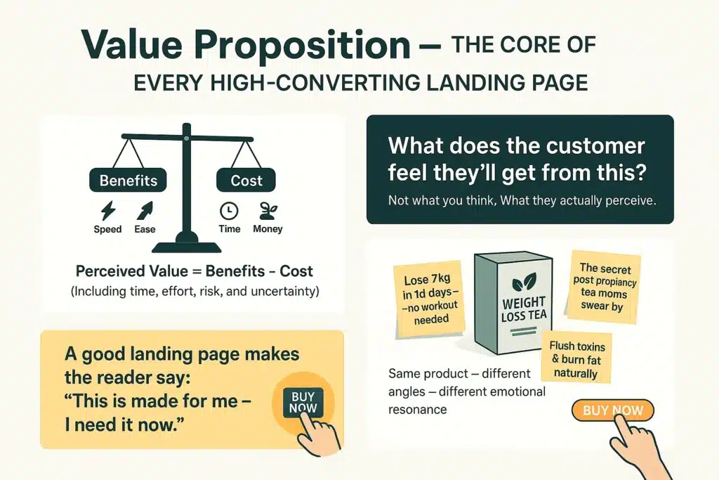
Value Proposition – How to Increase Perceived Value
This is the foundation of everything.
Without a strong value proposition, everything else—urgency, trust, even beautiful design—is just decoration.
Here’s the key question:
What will the visitor get if they take action on your landing page?
Not what you think they’ll get.
What they believe they’ll get.
One classic way to think about this:
Perceived Value = Benefits – Cost
And by “cost,” we don’t just mean money.
It includes time, effort, risk—and the quiet doubts they’re carrying.
In affiliate marketing, you don’t own the product. But you still have to sell it—with a unique angle strong enough to make someone click.
That’s why your angle matters so much.
Take a generic weight loss offer, for example. You could frame it in three completely different ways:
- “Lose 15 pounds in 14 days—without hitting the gym”
- “Detox and burn belly fat with 100% natural herbs”
- “The herbal tea new moms are secretly raving about”
Same product.
Three very different hooks.
Each speaks to a specific pain point—and each builds value in a different way.
A strong value proposition is built by understanding your audience, speaking directly to what they want, and helping them visualize the result before they buy.
A great landing page makes the reader say:
“This is exactly what I need—right now.”
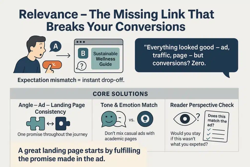
Relevance – Aligning Your Ads and Landing Page
This is one of the most common—and costly—mistakes in affiliate marketing.
You write an ad with Hook A. People click because they expect to see more of A.
But when they land on your page… it’s all about B.
So they bounce.
No one sends you a message to explain. They just leave—and never come back.
Your CPC looks great. Traffic is flowing.
But conversions? Zero.
Why?
Because your ad and landing page don’t match.
They’re not aligned.
They’re not part of the same story.
This disconnect kills campaigns.
As soon as a visitor feels, “Wait… this isn’t what I expected,” the trust is gone. And so is your ad budget.
So how do you fix it?
Here are 3 practical ways to increase relevance:
1. Align Your Angle, Ad Copy, and Landing Page
If your ad promises “weight loss without exercise,” then your landing page headline can’t be “a comprehensive wellness plan for long-term health.”
They clicked for easy.
Don’t make them read a lecture on holistic fitness.
2. Match the Tone and Emotion
If your ad is fun, casual, and light-hearted—don’t hit them with a serious, academic landing page.
If your ad promises “a fast solution for busy people,” don’t send them to a page that looks like a textbook.
Every mismatch creates friction. And friction kills conversions.
3. Think Like a Visitor
Before publishing your landing page, ask yourself:
“If I clicked that ad, would this headline deliver what I was expecting?”
Relevance isn’t about being clever.
It’s about putting the reader’s experience above your own assumptions.
A good landing page makes the reader nod immediately and think:
“Yep. This is exactly what I was looking for.”
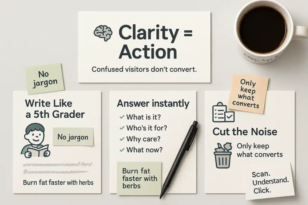
Clarity – Making Your Message Instantly Understandable
Many landing pages fail—not because the offer is bad, not because the angle is wrong—but simply because the reader has no idea what you’re trying to say.
Here’s the paradox:
- Beginners write too little.
- Veterans write too much.
One lacks enough info to persuade.
The other overwhelms the reader with jargon and complexity.
Both lead to the same outcome: no action.
Clarity doesn’t mean “dumbing it down.”
It means communicating your message in the clearest, most understandable way possible.
So how do you improve clarity on your landing page?
1. Write Like You’re Explaining It to a 5th Grader
Avoid industry jargon.
Avoid long, winding sentences.
Avoid clever-but-confusing wordplay.
Example:
Instead of:
“This proprietary formula combines bioactive compounds from natural sources to accelerate lipid metabolism.”
Say:
“Burn fat faster—thanks to herbal extracts that boost your metabolism.”
Your goal isn’t to impress.
Your goal is to be understood—fast.
2. Don’t Make People Guess
Within seconds of landing on your page, visitors should know:
- What is this product?
- Who is it for?
- What problem does it solve?
- What should I do next?
If they have to think for more than 10 seconds, they’re gone—back to Facebook, Reddit, or wherever they came from.
3. Every Element Must Have a Purpose
Look at your landing page and ask:
“Does this element increase conversions?”
If not—cut it.
Don’t be sentimental.
Every button, every sentence, every image… should reinforce the message.
If it doesn’t, it’s just noise.
You don’t need a “fancy” landing page.
You need a page that’s so clear, the visitor knows exactly what to do—without hesitation.
Because when things feel vague…
People don’t take action.
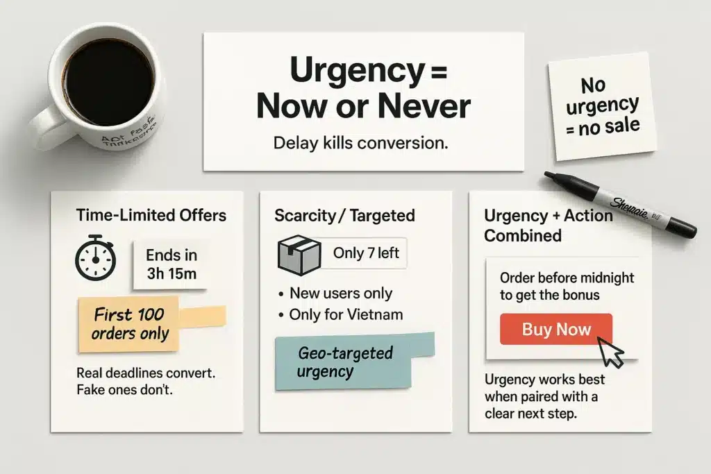
Urgency – Creating a Reason to Act Now
People don’t make decisions just because something “makes sense.”
They take action when they feel like they’re running out of time.
You can have a landing page that’s crystal clear, packed with benefits, professionally designed, and priced just right…
But if it doesn’t create a sense of “act now or miss out”, most people will walk away.
Not because they’re not interested.
But because they think: “I’ll do it later.”
And “later” almost never comes.
We’ve all done it:
- Need to update your credit card? I’ll do it tomorrow.
- Early bird discount on a course? Tomorrow.
- That product’s on sale? I’ll check back tomorrow.
Then poof—tomorrow never happens.
So how do you add real urgency to your landing page?
1. Add a Time Limit—But Make It Believable
Countdown timers can work. But if they’re fake or unexplained, they backfire.
“Only 5 minutes left to buy!”
→ Visitors will just hit refresh and see the timer reset. No pressure at all.
If you use a countdown, give it a reason.
Try something like:
- “Offer valid for the first 100 orders today.”
- “Ends this Sunday—part of our Birthday Week Sale.”
The more believable the reason, the stronger the urgency.
2. Limit Quantity or Audience
People want what they can’t easily have.
- “For first-time buyers only”
- “Available exclusively to U.S. customers”
- “Only 7 units left in stock”
You don’t need to lie—just find a real, believable reason why your offer is limited, and make it obvious.
Pro tip:
If you’re running an international campaign, you can use geo-targeting to customize location-based messages.
Examples:
- A visitor from Los Angeles sees: “Only available for customers in Los Angeles”
- A visitor from New York sees: “This offer is exclusive to New York residents”
- A visitor from Dallas sees: “Limited to Texas customers only”
It’s a small tweak—but it makes your offer feel personal and scarce at the same time.
3. Pair Urgency with a Specific Action
Instead of saying:
“Hurry! Don’t miss out!”
Say:
“Click ‘Buy Now’ before midnight to receive your free bonus.”
Urgency works best when it’s tied to a clear next step.
Remember: urgency isn’t about pressure or fear—it’s a gentle nudge that says, “Now is the best time to act.”
Because in affiliate marketing, if your visitor says “I’ll come back later,”…
That usually means never.
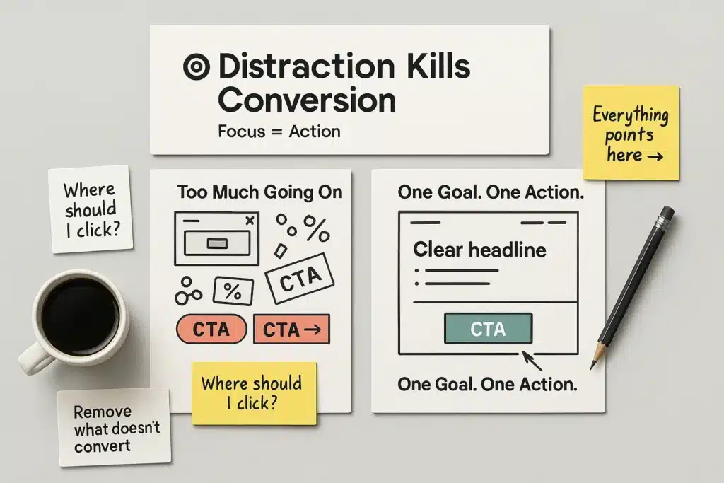
Distraction – How to Remove What’s Killing Conversions
A great landing page doesn’t need to do a hundred things.
It just needs to do one thing—and do it well.
The problem?
Many affiliate marketers try to cram too much into one page.
- Showcasing the product
- Telling the brand story
- Asking visitors to share
- Popping up a 20% discount for a different product
- Offering a free ebook in a popup
In the end, the reader has no idea what to focus on.
And when attention gets divided, so do conversions.
Here’s the golden question:
What is the one thing you want the reader to do next?
If you can’t answer that in three seconds, your landing page has a problem.
So how do you remove distractions?
1. Eliminate Anything That Doesn’t Serve the Main Goal
If your goal is to collect emails, then everything else—
Like buttons, other product offers, ebook popups, social shares—should go.
The fewer options, the higher the action rate.
2. Use a Clean, Minimal Layout
- Menu: 1–3 anchor links, pointing to your CTA or key benefits
- Sidebar: Either keep it empty or use it for product info only
- No extra CTAs cluttering the bottom of the page
- Whitespace: Use it wisely to guide the eye
Your landing page should feel like a one-way hallway.
No side paths. No detours.
3. Avoid Overdesigning
You don’t need floating animations.
You don’t need a cinematic 4K background video.
If it doesn’t clarify the message or drive action—it’s just noise.
Eliminating distractions doesn’t mean making your page look empty.
It means making it so clear that nothing gets in the way.
By the time someone finishes reading, their mind should go straight to:
“Click the button.”
Not:
“Hmm… let me scroll around and see what else is here.”
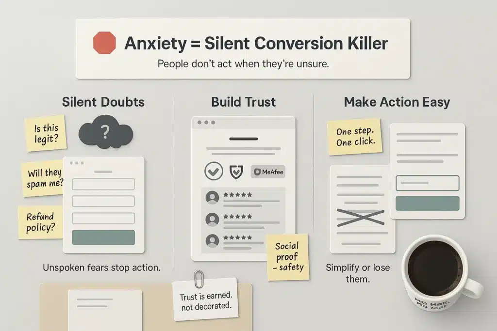
Anxiety – How to Make Visitors Feel Safe Enough to Click
A landing page is where you ask strangers… to take action.
To hand over personal info (name, email).
To click a link they’ve never seen before.
In a world filled with scams and shady offers, do you think that’s easy?
It’s not. It’s hard.
And whether you realize it or not—people are afraid.
They don’t say it out loud, but there’s a quiet checklist running through their minds:
- Will I lose money?
- Has anyone been scammed with this product?
- Is this a real page—or just a trick?
- If I enter my email, will I get spammed?
If you don’t actively reduce anxiety, those silent doubts will slowly kill your conversion rate.
So how do you help people feel safe?
1. Add Social Proof
People trust people—especially those who seem like them.
Here’s what you can do on your landing page:
- Show how many people have already purchased or signed up
- Display real feedback from real users (testimonials)
- If possible, include photos, names, or short videos to build authenticity
But a word of warning:
Don’t fake it.
Some affiliates use fake reviews to boost conversions.
It might get you a few early sales… but it’s a dangerous game.
If the advertiser catches you manipulating reviews, your account can be suspended, commissions withheld, and the entire campaign can collapse overnight.
In affiliate marketing, credibility is one of your most valuable assets.
Don’t trade long-term trust for short-term cash.
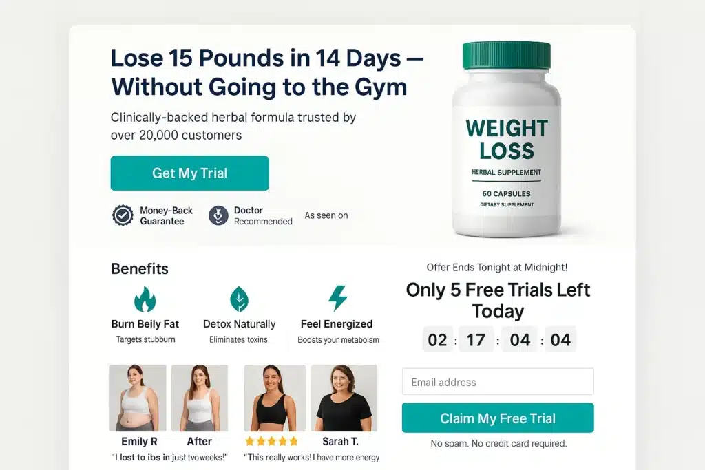
2. Use Trust Seals and Clear Guarantees
If you’re promoting an offer from a well-known brand, show their logo.
If there’s a money-back guarantee, make the terms clear and visible.
This isn’t about making your page “look nice.”
It’s about helping visitors breathe a little easier and think:
“Okay, at least this seems legit.”
Trust isn’t earned through design alone—it’s earned through signals of credibility.
3. Simplify the Action Step
If your landing page is designed to collect emails, make the process as simple as possible.
Because here’s what happens:
- The more fields in your form → the more skeptical people become
- The more steps in your funnel → the more likely they drop off
If all you need is an email, don’t ask for:
- Full name
- Phone number
- Gender
- Location
- Date of birth
Most people won’t object out loud.
They’ll just do nothing—and quietly exit the page.
Your job is to remove every hidden barrier that creates hesitation.
Make the action feel easy, natural, and low-risk.
Final Thoughts…
A landing page isn’t just a place to “display information.”
It’s where you persuade a complete stranger to take action—
using nothing but words, visuals, and a few precious seconds.
It’s a psychological challenge, not a design contest.
And when you’re unsure what to fix, what to test, or where to improve—
the LIFT Model gives you a clear roadmap.
Use it not just to optimize layouts or colors…
but to understand how readers think, what they feel, and what they need to see before they say “yes.”
- Increase value.
- Increase relevance.
- Increase clarity.
- Increase urgency.
- Reduce distraction.
- Reduce anxiety.
Six simple elements.
But if you patiently optimize each one—campaign by campaign, headline by headline—your conversions will grow.
Not explosively.
Not overnight.
But steadily. Sustainably. Predictably.
And the best part?
It won’t be luck.
It’ll be the result of your own work—not something borrowed, copied, or guessed.